Captain Pilot: A Techno-Sci-Fi Display Font That Elevates Digital Branding
Two days ago, I was finalizing the hero section of a new landing page for a boutique design studio—clean layout, bold imagery, and a tight content hierarchy. The headline needed to land with presence but not overwhelm. I tried three fonts before landing on Captain Pilot. Instantly, the tone shifted: confident, forward-looking, and unmistakably modern—without sacrificing clarity.
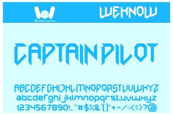
Captain Pilot is a techno-sci-fi display font designed for impact, not subtlety. Its sharp terminals, balanced geometric rhythm, and subtle tech-inspired asymmetry give it personality while staying legible at scale. It’s not futuristic in a retro-futurism way—it feels like typography built for today’s digital interfaces: sleek, intentional, and quietly intelligent. As a display font, it thrives where attention matters most—hero banners, section headers, CTA buttons, and branded graphics—not as body copy, but as visual punctuation.
I tested it across real scenarios: over a gradient image banner (works cleanly with 20% opacity overlay), inside a sticky navigation bar (at 24px, it held weight without crowding), and as a headline above a product grid on an online store. In each case, Captain Pilot added distinction without demanding extra design labor. That’s its quiet strength—it enhances polish without requiring custom kerning adjustments or complex spacing rules.
For a coaching website I’m currently refining, I used Captain Pilot only for the main headline (“Clarity Starts Here”) and the “Book a Session” button. Everything else—the subhead, testimonials, and course descriptions—stays in a neutral, highly readable sans serif. This contrast creates natural hierarchy: users scan first, then read. No cognitive load, no ambiguity about what’s primary.
On mobile? I kept the font size at 32px for headlines and set line-height to 1.15. It rendered crisply across iOS and Android Chrome. For smaller elements—like secondary CTAs or taglines—I dropped to 20px and paired it with tighter letter-spacing. No blurriness, no rendering lag. It’s web-optimized, with WOFF2 support and clean hinting that keeps edges sharp even on mid-tier devices.
Where Captain Pilot shines best is in short-form, high-impact contexts: blog post headers, campaign landing pages, portfolio project titles, digital brand kits, and social media banners exported from Figma. It’s less ideal for long paragraphs, multi-line buttons, or dense comparison tables—but that’s by design. As a display font, it’s meant to command focus, not sustain it.
Readability stays strong against both light and dark backgrounds, especially when you adjust contrast thoughtfully. Over a dark navy image, I used white text with a subtle 1px soft shadow—enough to lift it off the background without looking heavy. On light mode, a charcoal gray (#2D3748) gave better depth than pure black. And yes—it works over busy image overlays, as long as the underlying photo has enough negative space or tonal consistency behind the text area.
Font pairing is where many designers second-guess themselves. With Captain Pilot, simplicity wins. I consistently pair it with a humanist sans serif—think Inter, Manrope, or even system fonts like -apple-system—for all supporting text. Their open shapes and generous x-height balance Captain Pilot’s structured energy. For editorial-leaning projects—a redesigned blog or newsletter—I’ve paired it with a warm, low-contrast serif like Cormorant Garamond for bylines or pull quotes. The contrast feels intentional, not jarring.
Before dropping it into production, I checked the full package: six weights (Light through Bold), true italics, OpenType features including stylistic alternates and ligatures, and solid multilingual coverage—including Latin Extended-A and basic Cyrillic. No surprises in dev tools. No missing glyphs on staging. Licensing is straightforward commercial use—no per-page fees or subscription locks—so it fits cleanly into client handoffs, SaaS dashboards, and template libraries.
One thing I appreciated during testing: Captain Pilot doesn’t ask for special treatment. It doesn’t need oversized tracking to breathe, nor does it collapse at small sizes. Its proportions are tuned for screen legibility—cap height sits comfortably above the x-height, ascenders don’t compete for space, and lowercase ‘a’, ‘e’, and ‘g’ remain distinct even at 24px. That reliability makes it a trustworthy asset—not just a stylistic flourish.
For a product landing page, I used it exclusively for the headline, feature icons’ labels (“Real-Time Sync”, “Zero Latency”), and the final CTA (“Launch Your Trial”). The rest—benefits list, FAQ toggle labels, footer links—stayed in a clean sans. Result? Faster visual parsing, stronger brand cohesion, and zero revisions from the client on typography direction.
It’s also becoming my go-to for digital brand kits where clients want “modern but not cold”—especially for creative studios, indie tech tools, and learning platforms launching new courses. There’s warmth in its precision. Authority without austerity. And because it avoids the overused tropes of sci-fi fonts (no excessive angles, no forced glitch effects), it feels fresh but familiar.
If you’re evaluating Captain Pilot for your next project, start small: drop it into one high-visibility spot—your homepage headline or primary CTA—and test it across devices. Check how it behaves next to your existing color palette and imagery. See how it pairs with your current body font. You’ll know within minutes whether it lifts the whole experience—or just adds noise.
At its core, Captain Pilot isn’t about being “different for difference’s sake.” It’s about having a display font that supports your voice, strengthens your hierarchy, and helps users understand—immediately—what kind of experience they’re stepping into. In a world of generic sans serifs and overused scripts, that kind of intentionality is rare. And valuable.